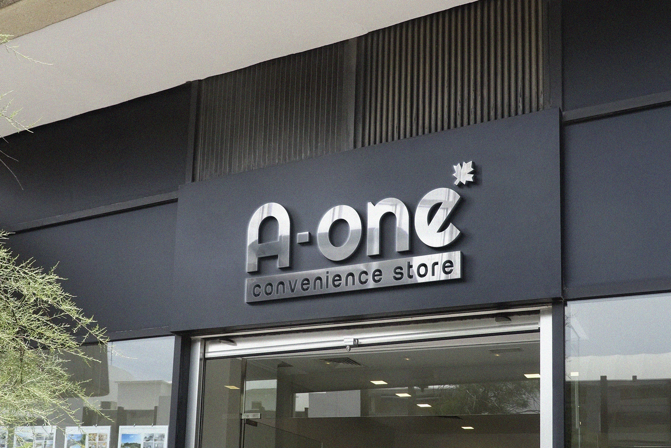
We created a clean, polished logo for A-One Convenience Store, a retail brand focused on accessibility, quality, and daily essentials. The goal was to deliver a logo that balances simplicity with sophistication, while remaining highly legible for storefront signage and branding applications.
The metallic finish adds a premium feel, while the curved typography communicates friendliness and trust. The subtle asterisk-shaped leaf detail beside the ‘e’ adds a unique identity element, making the logo distinctive and memorable in retail environments.
Key Highlights:
- Sleek, 3D metallic signage presentation
- Minimal yet bold typography with approachable curves
- Distinctive asterisk/leaf icon for brand recall
- Scalable design optimized for both digital and physical use

