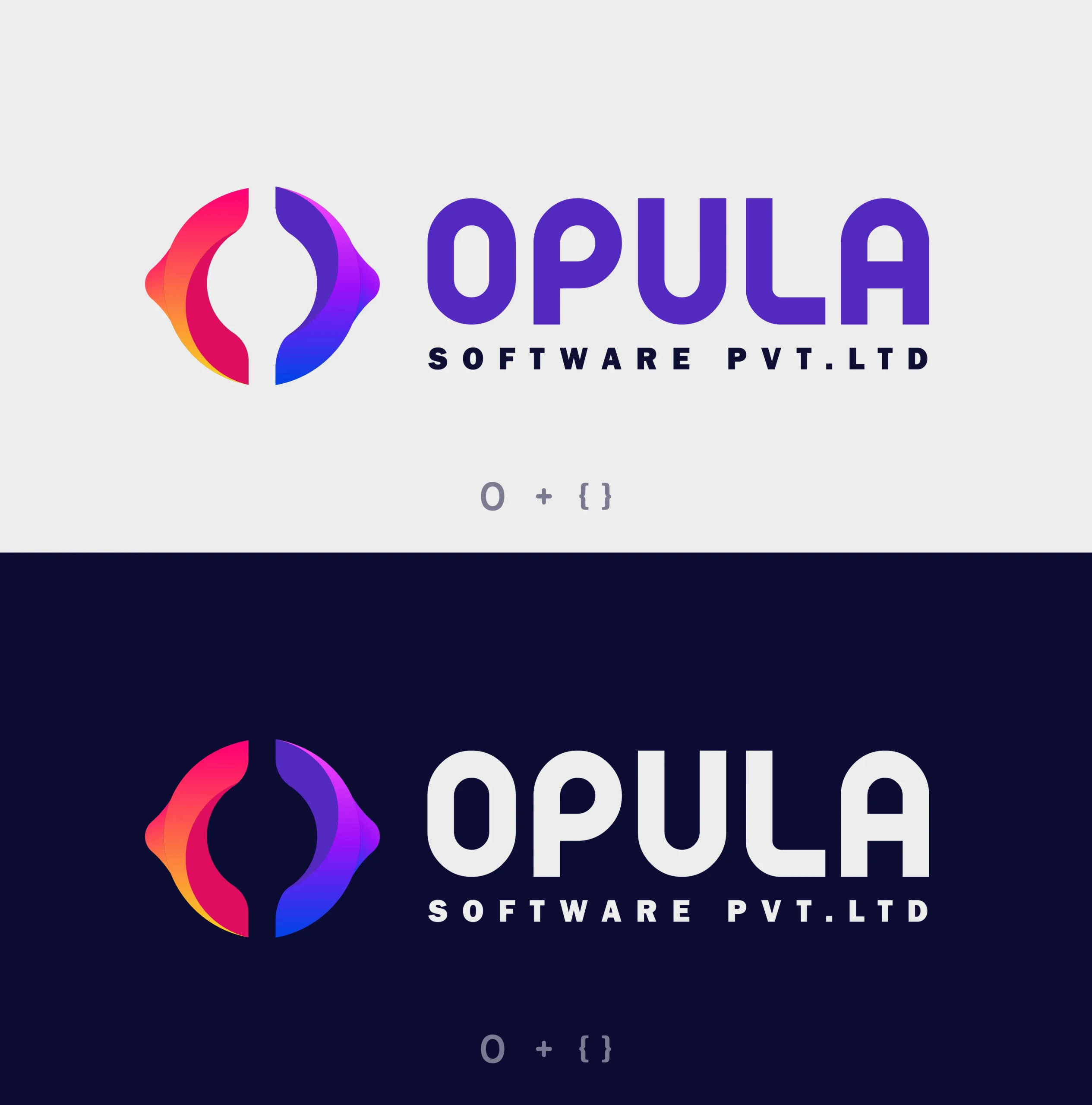
We designed a vibrant and meaningful brand identity for Opula Software Pvt. Ltd., a forward-thinking software company. The icon creatively merges the letter “O” with curly brackets {}—a subtle nod to coding and development.
The result is a symmetrical, tech-inspired logo that feels modern, approachable, and instantly recognizable. The gradient color palette (blending red, pink, purple, and blue) represents innovation, diversity, and transformation, while the bold typeface ensures clarity and strength across all brand touchpoints.
Two contrasting backgrounds (light and dark) were used to ensure the brand stays consistent and impactful across both digital and print media.
Key Highlights:
- Logo built around “O + {}” to reflect software & logic structure
- Smooth gradient for a bold, creative tech feel
- Rounded modern typography for legibility and strength
- Designed for seamless integration into digital platforms, dev tools, and mobile apps

